Discover the 16 essential graphic design principles that every designer should know. Learn how to implement contrast, alignment, color, typography, and more for effective and visually appealing designs.
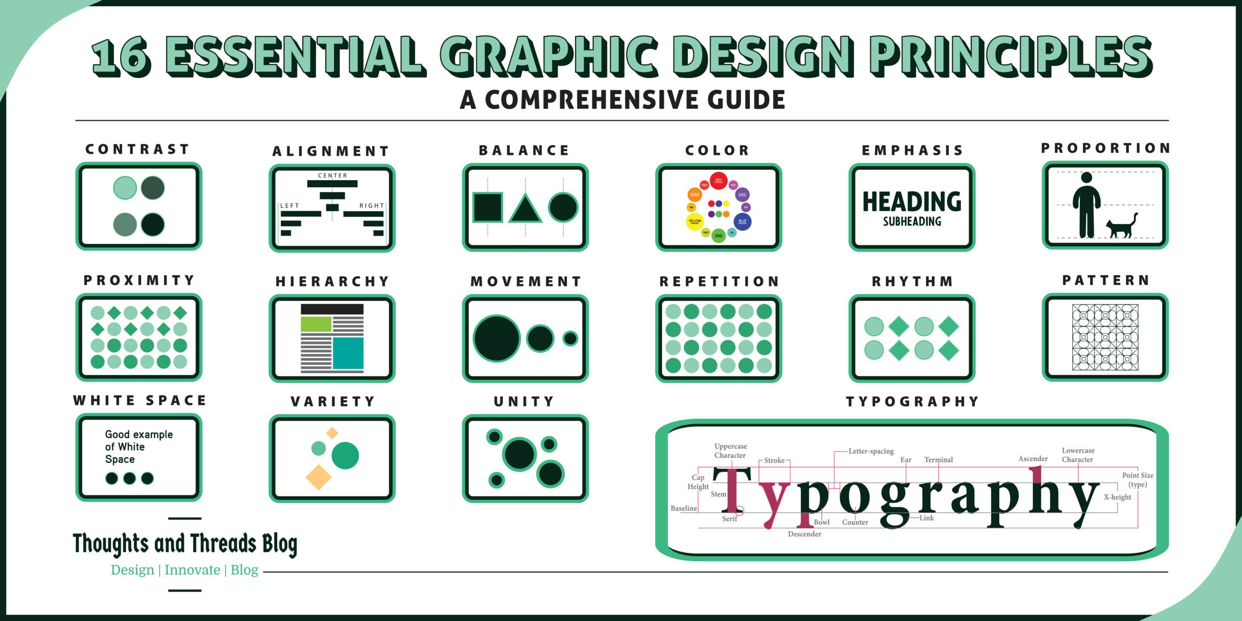
Graphic design is a creative tool of visual presentation which is both art and a utilitarian tool. The mastery of this art requires an individual to be well conversant with some graphic design basics. It would be our pleasure to show you seventeen of the most critical principles in graphic design and how to apply them in this detailed guide.
Table of Contents
What Are Graphic Design Principles?
Design elements, also known as graphic design principles, are the basic rules that must be followed to make a design properly harmonious, balanced and effective. They help in the arrangement of graphic components such as type, hue and form in good and viable arrangements. These principles help designers in developing works which will convey the intended message to the target group.
The Importance of Graphic Design Principles
Graphic design elements are the foundation for any graphical creation hence they dictate the way information is disseminated. And when all these elements are well incorporated, it makes the design more effective or else you end up with a beautiful object that is of little or no use. It is essential that anyone involved in design, whether for the Web, print, or brand identity determine the inherent meaning of these objects.
Here’s a deeper look into why graphic design principles is so important: Here’s a deeper look into why graphic design principles is so important:
- Communication: The rules of design help to make the message easily understandable once it is conveyed to the viewer.
- Aesthetic Appeal: Appropriate design draws attention and keeps them glued on the content with little or no persuasion needed.
- User Experience: Elements such as hierarchy, contrast and balance are all beneficial to the usability in web and application interface design.
- Brand Consistency: Designing issues should be well implemented and followed and this is because designing principles aid in the creation of uniform brands making businesses easily identifiable.
- Improved Visual Impact: Some of the principles include contrast, color, and typography, effective application of such principles to a design makes it memorable.
Now, let’s dive into the essential graphic design principles one by one.
1. Contrast
“Contrast isn’t just about color—it’s about creating visual hierarchy.” – Dieter Rams
Brief Description: Contrast is the use of opposition between two or more things in a piece of artwork. It is useful in enhancing key aspects of a document and increases legibility.
How to Implement in Design: One should utilize contrast as a way of making objects stand out, as focal points and to help direct the viewers’ attention. This can be done in different techniques, for example color variation, size and shape.
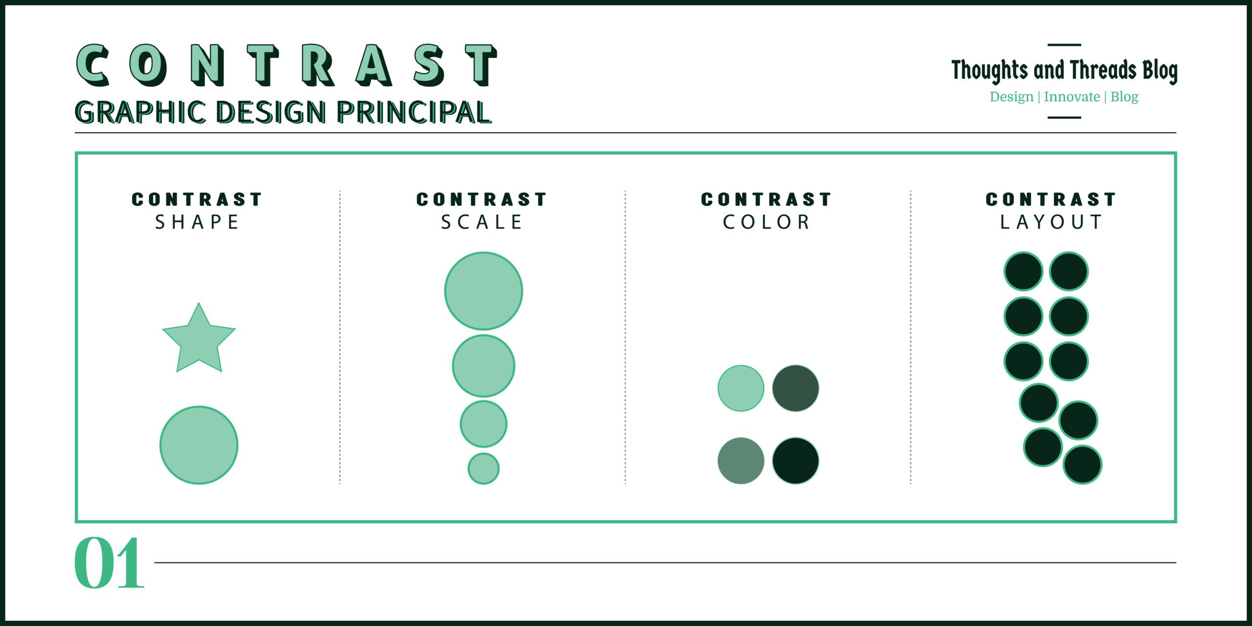
Examples: Colour contrast; A black text on the white background gives a high contrast, which makes the text more comprehensible. As much as that is true, placing contrasting colors such as black and yellow on a call-to-action button makes it stand out.
Sub-Principles:
- Color Contrast: Such as utilizing colors which are opposite each other in the color wheel.
- Size Contrast: I chose to adopt size as the criteria of differentiation where the elements of interest are considered more significant.
2. Alignment
“A strong alignment creates a sense of structure and purpose.” – Paul Rand
Brief Description: Alignment is a layout technique whereby the interrelated positions of some or all the layout components or parts are considered and placed. It makes relation between the different components that are shaded into the figure.
How to Implement in Design: Ensure that the text and images are well arranged along one direction to ensure that the viewer’s attention is well regulated and not distracted by other awkward positions. Try to keep grids and guides that will help an artist to maintain a consistent flow in the type of artwork being done.
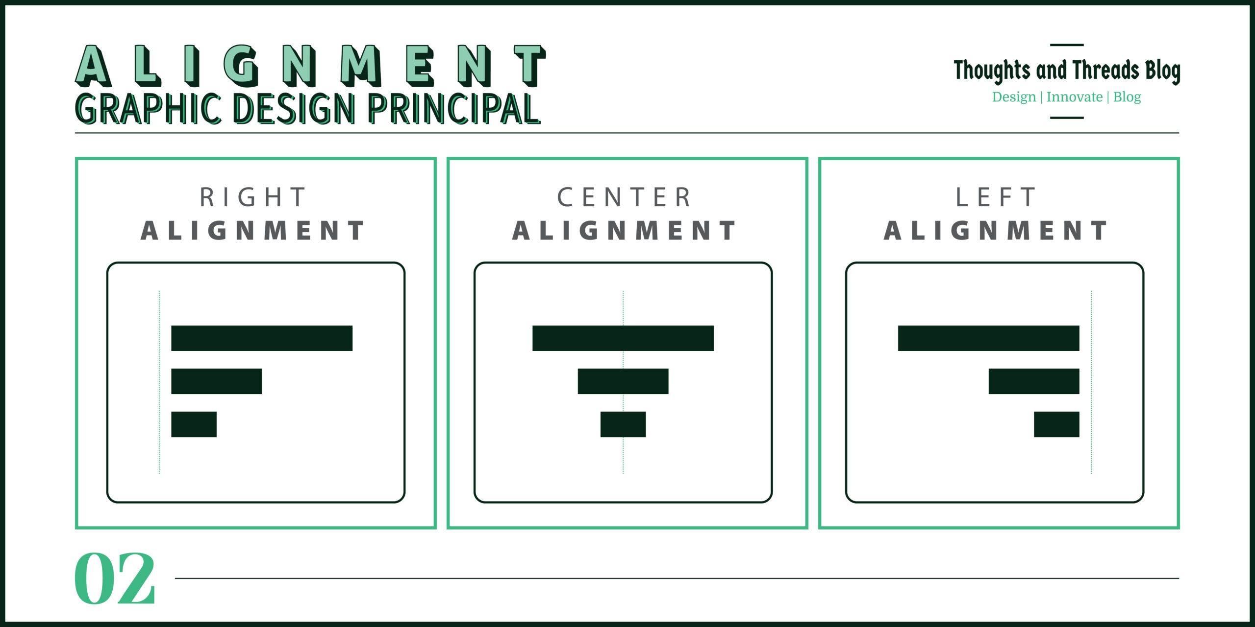
Examples: Text center in a heading can work as good central point and text left alignment in body copy works neatly and can be readable.
Sub-Principles:
- Edge Alignment: Bearing in mind the fact that elements have shapes, and one can align them towards their edges.
- Center Alignment: Jointing components so they are parallel with each other.
3. Balance
“Design is a balance between form, function, and the message.” – Milton Glaser
Brief Description: The symmetry is the division of the visual weight in each side of the layout or design. The structure can be symmetrical or asymmetrical and aids in developing the feeling of stability also.
How to Implement in Design: Elements can be evenly spread, or a sense of asymmetry can be designed to lead viewer’s eye towards certain areas.
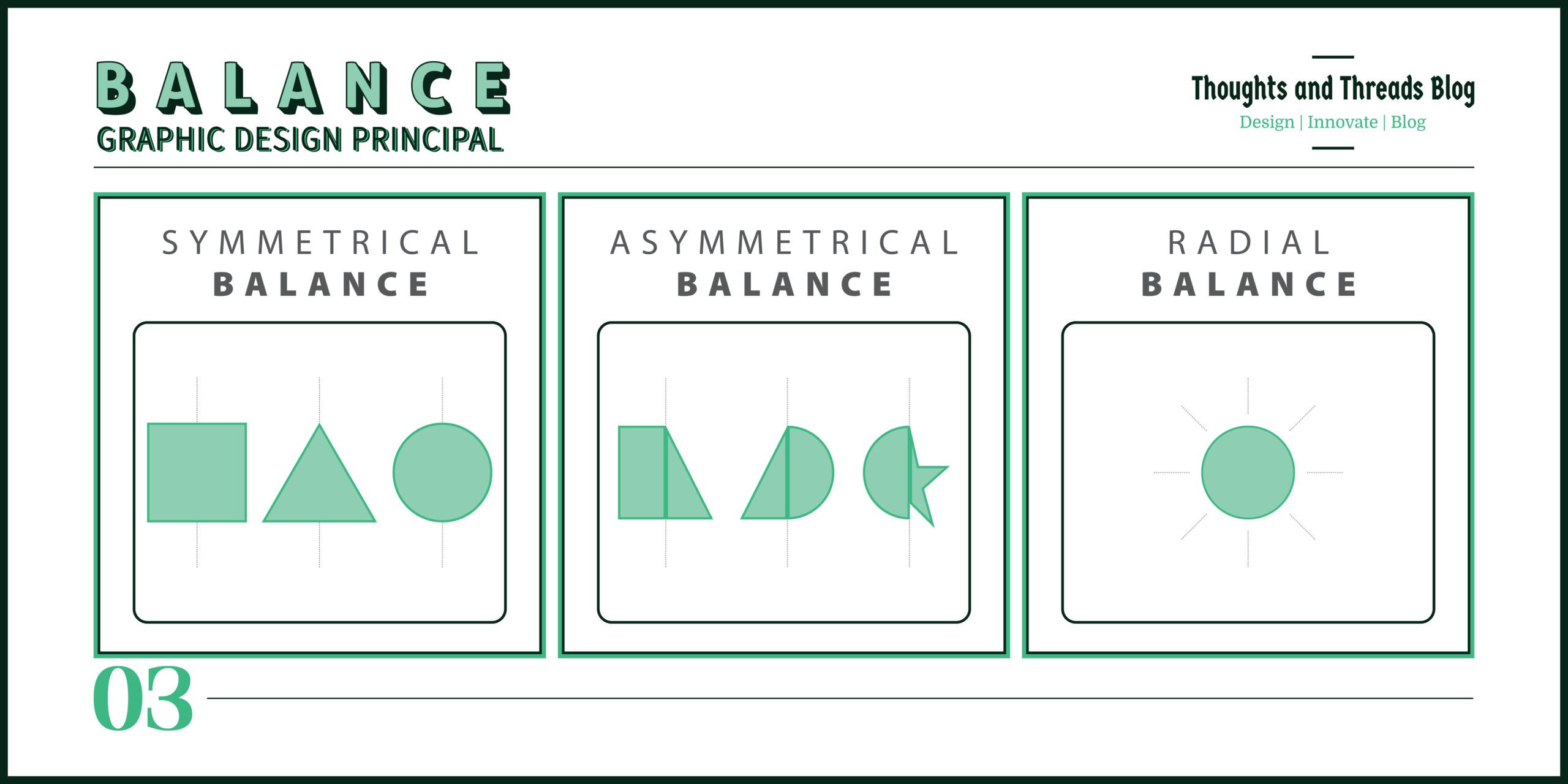
Examples: In symmetrical balance objects are arranged in such a way that one side is a mirror copy of the other while in asymmetrical balance is the use of several elements in a balanced but not equal manner.
Sub-Principles:
- Symmetrical Balance: Elements are distributed equally in the two halves of the split octahedron.
- Asymmetrical Balance: Asymmetry of parts which still balance in one way or another to form a part of the whole.
- Radial Balance: Another type is radial balance – this type of balance makes people focus on a certain point and adds depth to the artwork.
4. Color
“Color can speak louder than words in a design.” – Saul Bass
Brief Description: Colour has an ability to enhance moods, and it also possesses capability to convey different meanings, and be capable of creating diverse kinds of interest. It is one of the most effective methods of reaching out and promoting the image of a company.
How to Implement in Design: Select colors with their effects on the mind and body and pick their combinations in the design. Take the time and effort to find out about color themes by using principles associated with the color theory.
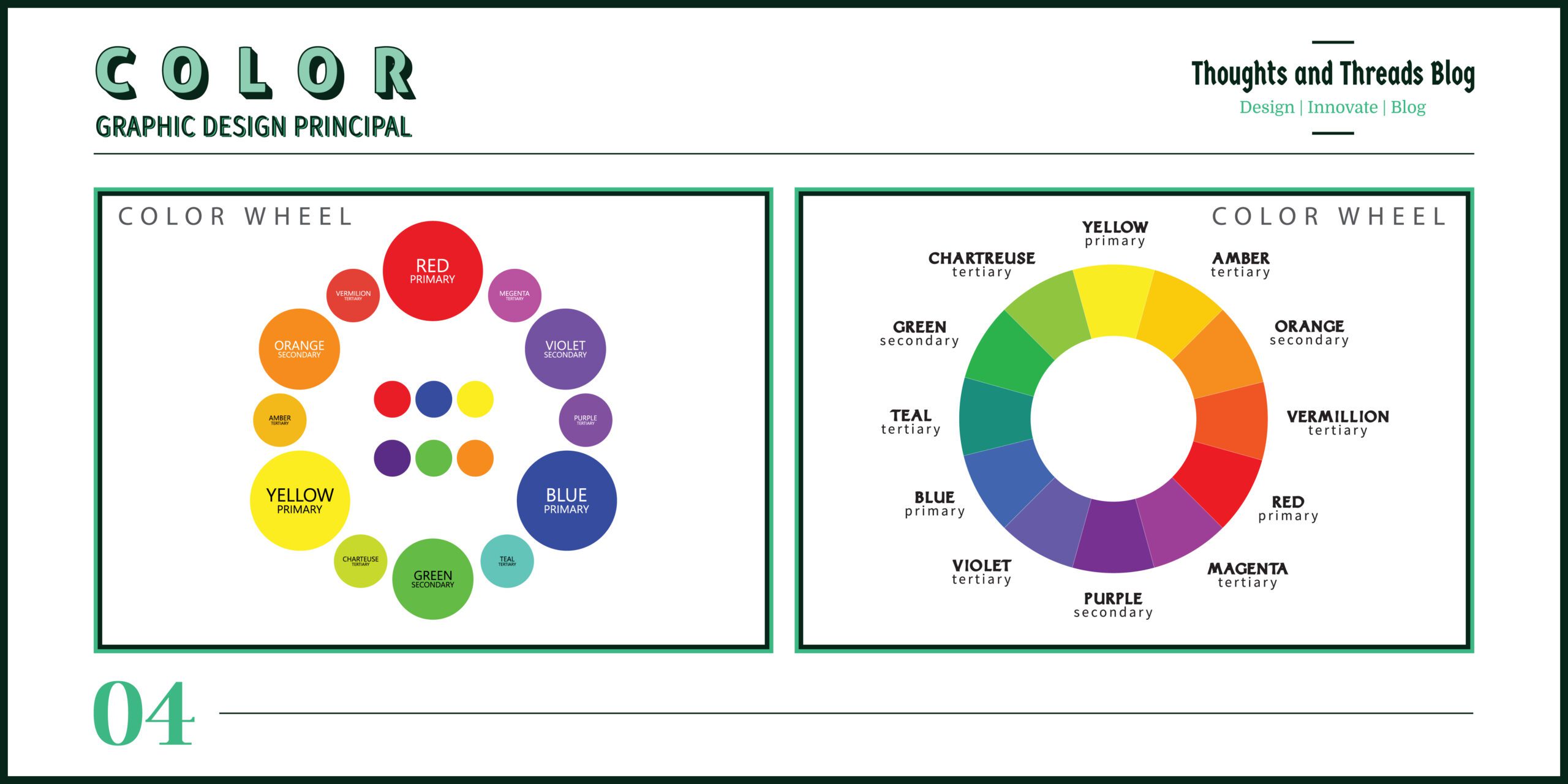
Examples: This colour can illustrate trust and professionalism, that’s why it is widely used in the symbols of different companies. Such color combinations as blue and orange look favorable due to the absolute contrast of colors which results in bright and active combinations.
Sub-Principles:
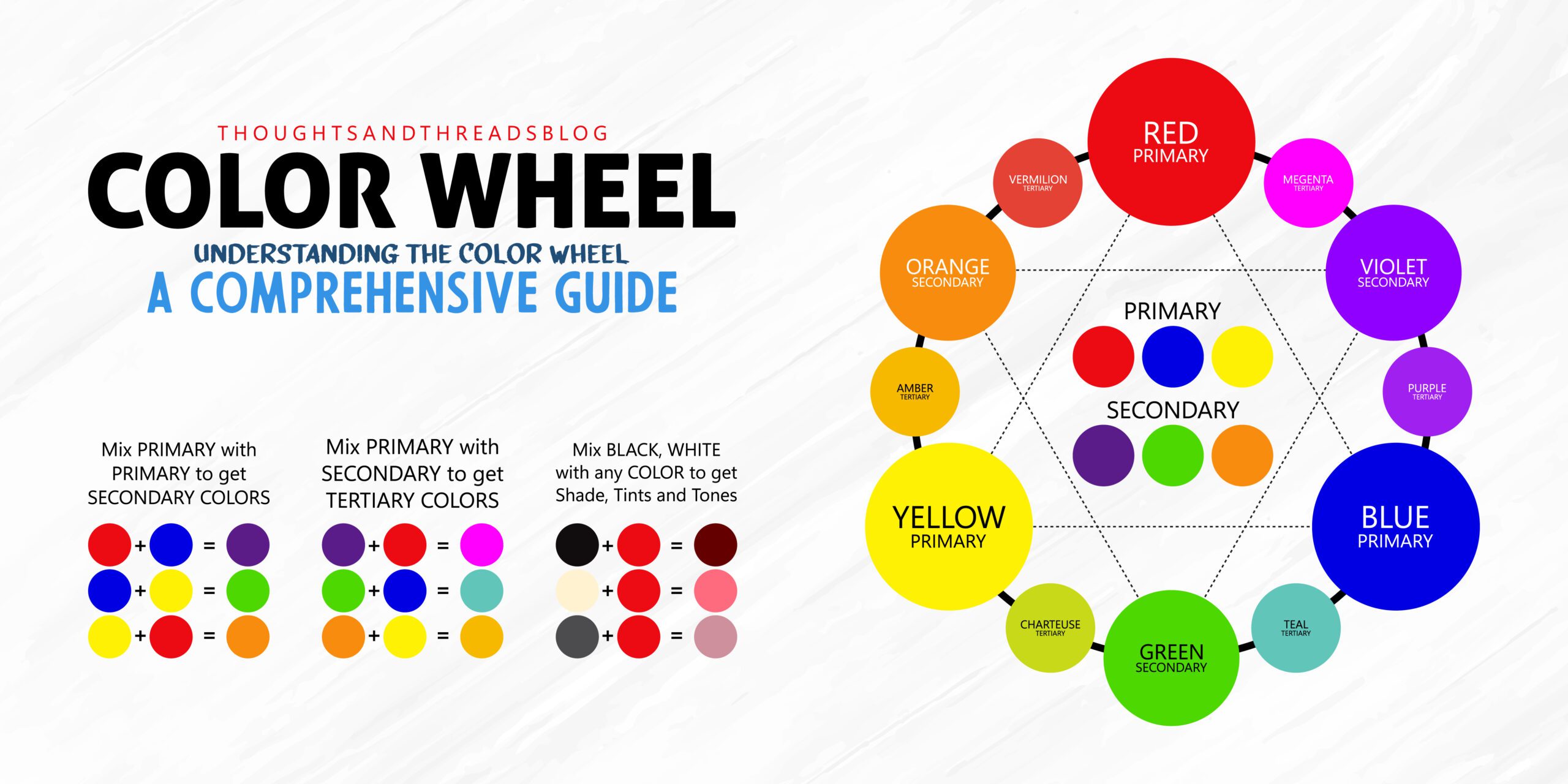
- Color Theory: General knowledge about color wheels such as complementary and analogous color.
- Color Psychology: Using colors to bring about particular feelings.
5. Emphasis
“Emphasis is the heartbeat of visual hierarchy.” – Michael Bierut
Brief Description: Highlighting focuses the attention of the viewer to certain areas of a design. It assists in the focusing of certain messages or some aspects in getting the attention of the readers.
How to Implement in Design: Add a focus to certain components using size, color, contrast or position.
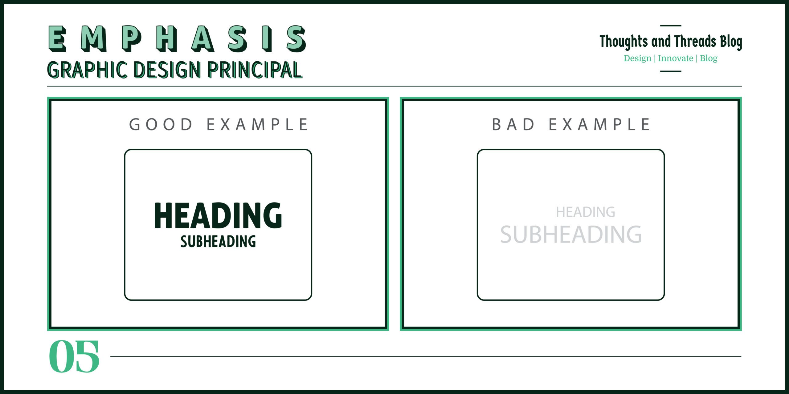
Examples: A headline is considerably big and conspicuous from the rest of the text hence making it capture the client’s attention to the main message. On the page with a color palette that could be regarded as nonintrusive, a small, intense red button emphasizes the call-to-action.
Sub-Principles:
- Size: Larger elements naturally attract more attention.
- Color: Bold or contrasting colors can highlight key elements.
- Isolation: Placing an element in an otherwise space makes it pop.
- Placement: Elements at the top or center of a design tend to be noticed first.
6. Proportion
“Proportion is the key to creating a sense of order in design.” – Le Corbusier
Brief Description: Ratio concerns the dimensions ratio of objects, meanings the size and scale of objects in a design. It determines the position and arrangement of individual elements and their regards to the rest of scenography specifics.
How to Implement in Design: One must remember that all the elements of a design should be in proportion so that they look harmonious and balanced. To make sure elements are appropriate size it is recommended to use grid and guidelines.
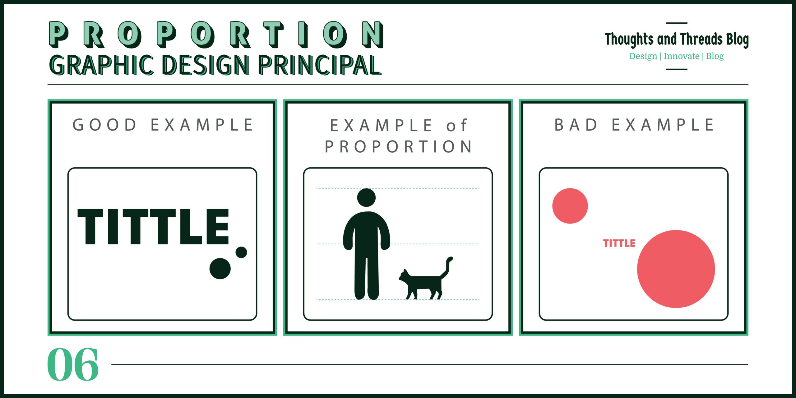
Examples: The rule of thirds is one of the known proportional regulations, stating that the design must be partitioned into nine equal sections, and focal objects and people must be placed along these lines or their intersections.
Sub-Principles:
- Golden Ratio: This is a common mathematical ratio which can be employed to attain an optimum esthetic measurement.
- Rule of Thirds: How to create a mature balanced composition by dividing a design into thirds.
7. Proximity
“Good design uses proximity to guide the viewer’s journey.” – Massimo Vignelli
Brief Description: Distance is used to describe conditions whereby related elements are placed in close contact. For it is easier to associate things in this manner and create the concept of objects’ relations.
How to Implement in Design: Always arrange the related elements or objects which are to be placed on the same page close to one another so that the reader may find it easy to follow through the page.
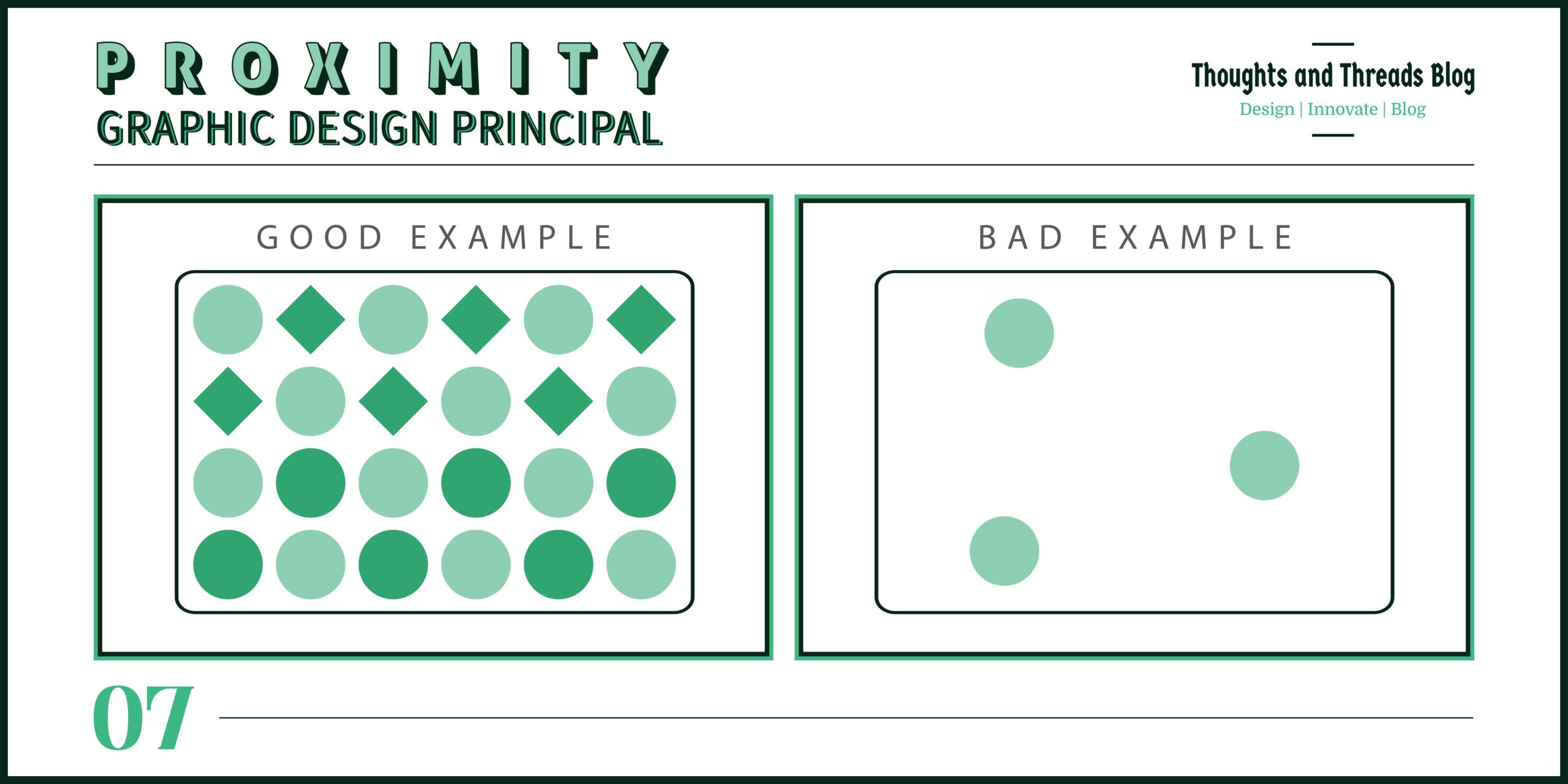
Examples: Hence, if contact details are placed together on the business card or if related items are placed together in the menus, then it will make it easier for the users.
Sub-Principles:
- Visual Grouping: Exploiting location in elucidation of how assorted ingredients are connected and interdependent.
- Whitespace: It is beneficial to allocate space in a way that would allow for separation of individuals/Groups.
8. Hierarchy
“In design, hierarchy is about telling the audience what to look at first.” – Stefan Sagmeister
Brief Description: Aristotle’s notion of Hierarchy means arranging visual components in a design to establish the primary, secondary or the structure of which carries the viewer’s attention throughout a Composition.
How to Implement in Design: However, size, color, contrast and eventually placement should do enough to show that there is light on the top and therefore the recognizable image.
- Organize information: Use hierarchy to structure complex information so that it’s easy for the viewer to digest.
- Create a visual flow: Guide the viewer’s eye through your design by strategically placing elements in a hierarchical order.
- Ensure clarity: Make sure your most important message is the most prominent element in your design.
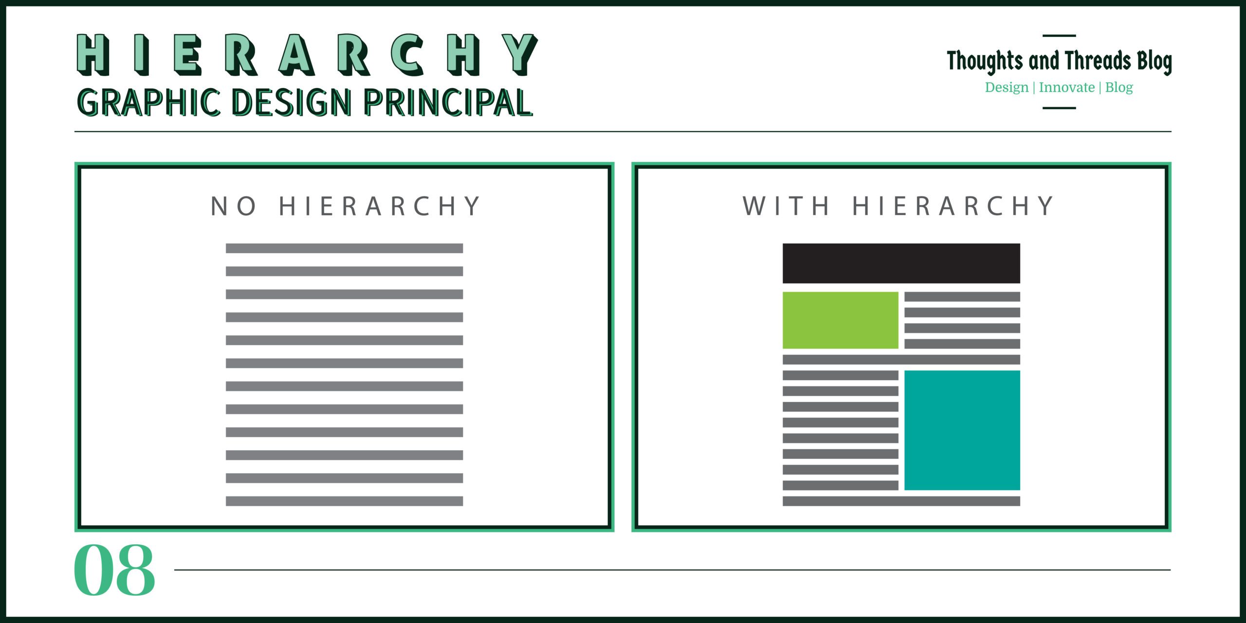
Examples: A large, bold title and another title in slightly smaller lettering followed by the body text creates a good sense of vertical structure where it is easy to distinguish what is the title, the sub-title and the body text.
Sub-Principles:
- Visual Hierarchy: Proper prioritization of issues at hand.
- Typographic Hierarchy: Making it easier to distinguish between levels of information by writing some of it in large fonts and other small ones and writing some of it in bold while leaving other parts in normal fonts.
- Color and Contrast: Use bold colors or high contrast to draw the eye to key elements.
9. Movement
“Great design leads the eye; movement is its guide.” – Saul Bass
Brief Description: Movement leads a viewer’s eye to a particular direction inside a design. It adds purpose, a way forward and different actionable steps that are supposed to give the project order and coherence.
How to Implement in Design: Some of the ways in which the graphic designer can guide the viewer is by utilizing lines, the shape, and positioning.
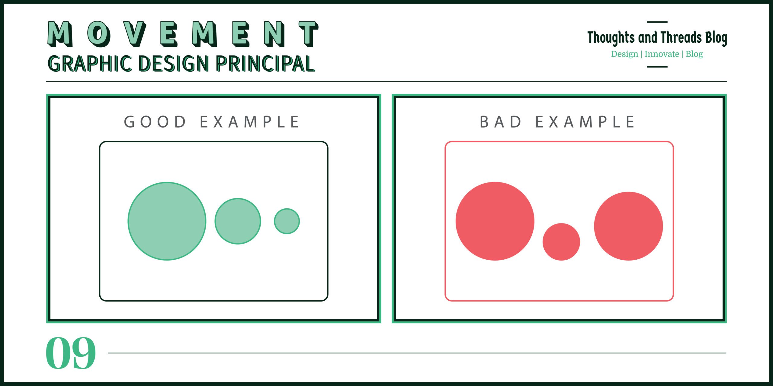
Examples: Diagonal lines could make an impression of the speed, and when several pictures are arranged in sequence – the viewer is given the direction where he has to go.
Sub-Principles:
- Directional Lines: Applying lines as the means of guiding the viewers’ focus.
- Visual Flow: Positioning parts, which make the transmission of events as smooth as possible.
10. Repetition
“Mastering repetition is mastering the art of visual consistency.” – Jessica Walsh
Brief Description: Repetition entails the use of related items within the design process to enhance uniformity
How to Implement in Design: Applying consistent colors, shapes, texts or patterns on different parts of the design is another way to level different components.
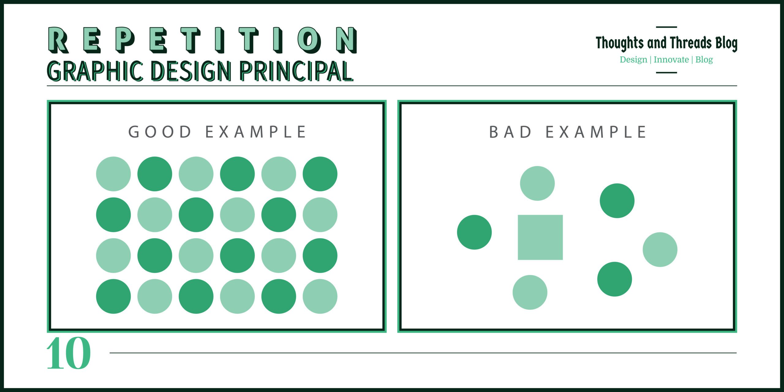
Examples: Retaining such inevitable brand colors and fonts on a website also ensures brand image consistency. If a pattern is made in the background of a flyer and the same pattern is continued, then it gives a harmony look.
Sub-Principles:
- Pattern Repetition: Applying the concept of the regular repetition of motifs to obtain a harmonious design.
- Consistency: The act of retaining specific design concepts consistently to across a project.
11. Rhythm
“Design uses rhythm to create a sense of movement and continuity.” – Paula Scher
Brief Description: Rhythm is the pattern which is made when similar items are used repeatedly. As an element, it assists in generating circulation in a design.
How to Implement in Design: Employ the use of similar repetitions and variation in size, colors or even the shapes to make it rhythmical.
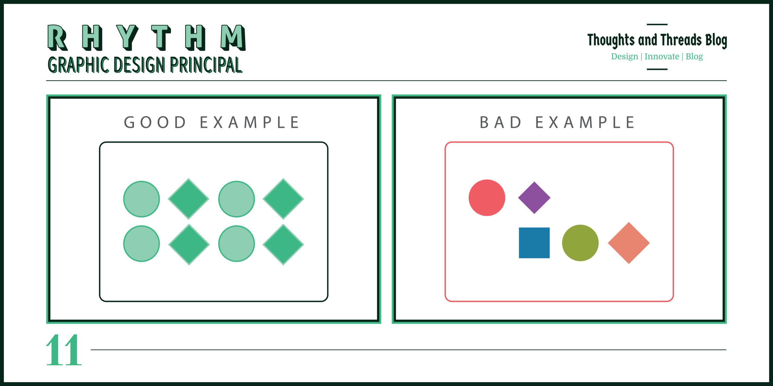
Examples: It is possible to use separate images or groups of textual information in a timeline that will put much pressure and guide the viewer’s sight across the design in a rhythmical manner.
Sub-Principles:
- Regular Rhythm: Equal inter-elements spacing or at least the retention of equal distances when changes are made.
- Flowing Rhythm: Accommodation where slight changes are made to the stakeholders’ expectations to enable a smooth transition.
12. Pattern
“A strong pattern in design turns ordinary into extraordinary.” – Saul Bass
Brief Description: Pattern may be defined as an aesthetic course of elaborating and unifying motive in an input area and attaching an ornamental significance to it.
How to Implement in Design: Remembering that patterns help to add interest and create continuity it is advisable to use copies of shapes, colour or texture.
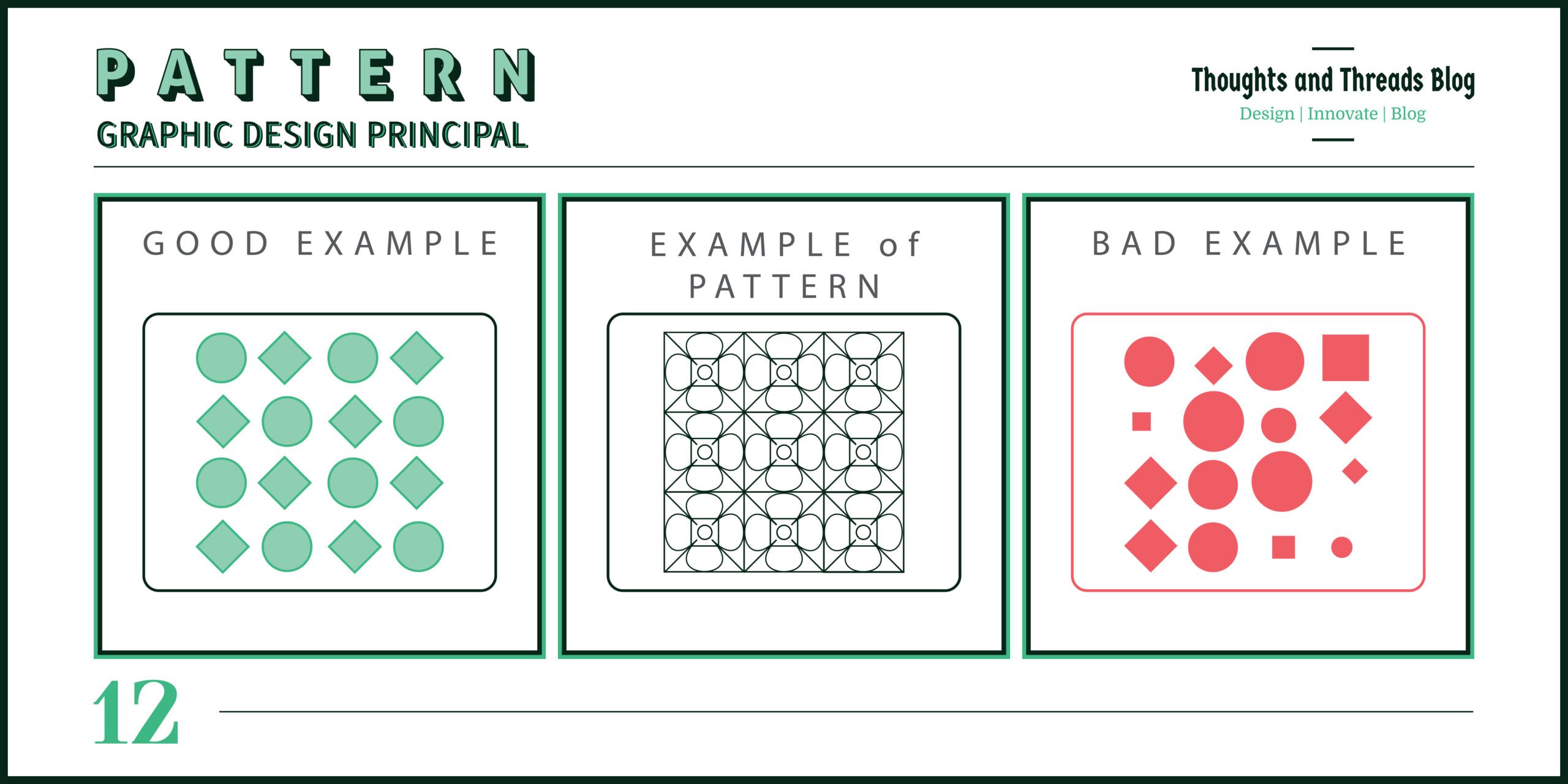
Examples: Implementing geometric pattern to the background or having some motif on the packaging will improve the look and the overall branding.
Sub-Principles:
- Geometric Patterns: How to produce well-organized forms and lines.
- Organic Patterns: Organic form and textural based forms for smoother look of the products.
13. White Space
“White space is not a void; it’s a powerful design element that creates balance.” – Paul Rand
Brief Description: White space or negative space is the space that is between or around the objects of the design. This keeps off unnecessary accumulation of items in the surroundings and enhances neatness in the presentation of information.
How to Implement in Design: The white space should be used in a way that important aspects should emerge from these spaces hence leaving the general page or layout cleaner.
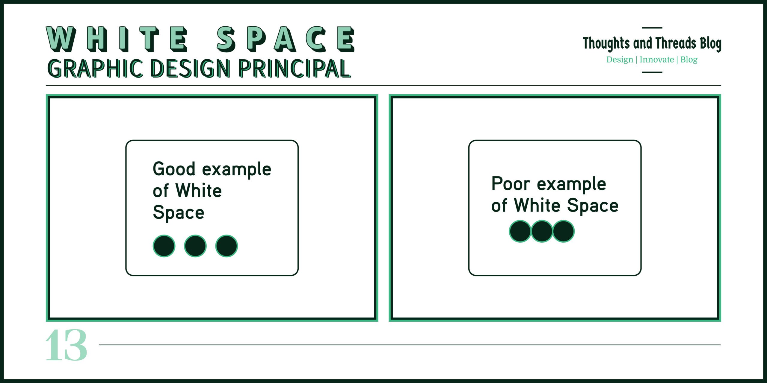
Examples: Having frame-like borders around certain chosen texts and pictures and using free places in the layouts also leads to emphasizing certain content and increasing the actual clarity of design.
Sub-Principles:
- Active White Space: Space carefully inspired to dictate the direction of the viewer’s attention.
- Passive White Space: Able to calculate voids in and around elements.
14. Variety
“Variety is the spice of life, and it’s also the secret to keeping visual communication fresh and engaging.” – Neville Brody
Brief Description: Variety, as the name suggests, involves the use of different elements and styles to avoid monotony. It has the advantage of enhancing the diversity as well as the dynamic nature of a particular design.
How to Implement in Design: It is recommended to use different shapes, colors, textures and the size of the items used to design to avoid making the design monotonous.
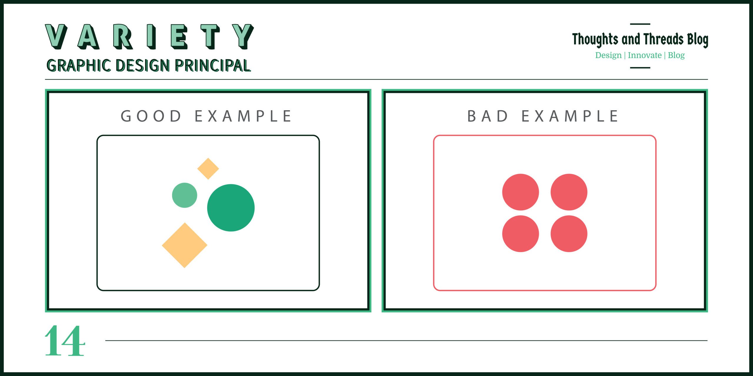
Examples: Applying different fonts in a typography or placing varied shapes and colors in a graphic design can make design more interesting. Buttons can be of various shapes and colors and from a website’s perspective, different buttons can have different shapes and colors.
Sub-Principles:
- Contrast in Elements: Applying variety in the use of the four aspects of visuals to bring variation.
- Mixing Styles: Different types of designs incorporated together to achieve a particular design.
15. Unity
“The power of unity in design is that it draws the eye naturally, making the experience intuitive and immersive.” – Chip Kidd
Brief Description: This means that it is easier to come up with a well-integrated design when you are focusing on unity of designs. The symmetry contributes to a completeness and a unity in the style of a design that is hard to achieve otherwise.
How to Implement in Design: Ensure that style, color and the elements used are consistent all over the design work. Make sure that all the parts add to the complete harmony in the appearance of the total construction.
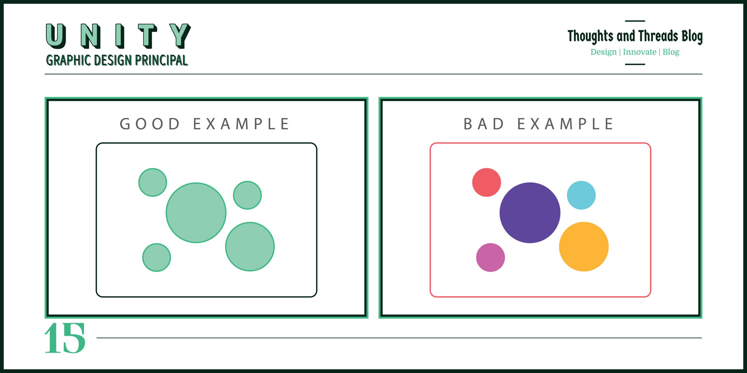
Examples: For creating good brand awareness, all brochures should have some related issues such as color combinations, fonts, and images. Every page makes you feel like you are on the same page as the other, and with the same message that is being passed across.
Sub-Principles:
- Visual Consistency: This entails making sure that all the items in a set have some sort of commonality in terms of the appearance that they extend.
- Thematic Unity: It is the method of placing elements in a coordinated framework and arranging them within the core theme or idea.
16. Typography
“Typography is the voice of the text. It gives meaning beyond the words.” – Ellen Lupton
Brief Description: Typography means the objective and systematic discipline of giving types a visually effective form for the purpose of reading. It has a significant impact in expressing the mood and character of a design in question.
How to Implement in Design: Select the proper typeface and size and the style that corresponds to the aim and the concept of the work. Being neat is critical: You need to pay attention to the spacing, alignment and hierarchy, for the document to be more pleasing on the eye and easier to read.
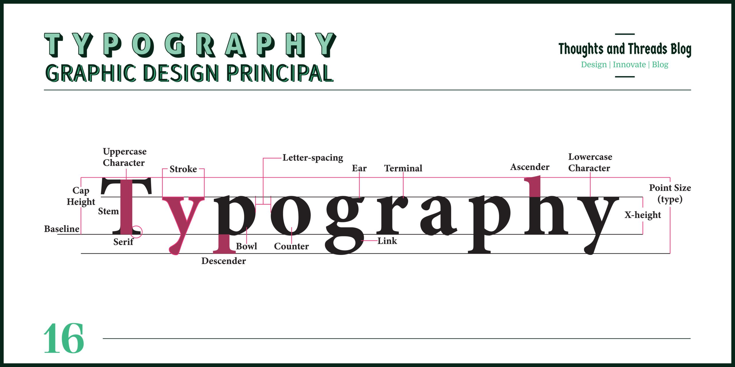
Examples: A business website may choose to use simple font such as Ariel, Helvetica and others as to ensure maximum readability, while a fashion magazine website may choose to use a more elegant looking fonts such as the serif fonts. Good installations of kerning as well as positioning the line in the correct manner helps a lot in enhancing the parlance of the message and appearance of the text.
Sub-Principles:
- Font Selection: Selecting the appropriate type of fonts that match the theme or mood of the design as well as its applicability.
- Text Hierarchy: Organizing content in a text using pro-portioned font size and weight.
Final Thoughts
To sum up, the following sixteen principles of graphic design will greatly improve your design comprehensiveness. Thus, knowing contrast, alignment, balance, etc., a designer will provide people with designs which will not only look good but also imply the corresponding meanings. Remember, these principles should not be limited in terms of being hard and fast rules but can act as guidelines and can be well executed with creativity in different recommended design fields.
References and Resources
References and Resources
- “The Elements of Graphic Design” by Alex W. White – A comprehensive guide to the principles and practice of graphic design.
- “Graphic Design Basics” by Amy E. Arntson – A foundational text for understanding graphic design principles.
- Adobe Color Wheel – An online tool for exploring color theory and creating harmonious color schemes. Adobe Color
- Canva Design School – Offers tutorials and articles on various design principles and techniques. Canva Design School
- Design Basics Index by Jim Krause – A comprehensive guide to understanding and applying design principles.
- The Non-Designer’s Design Book by Robin Williams – A beginner-friendly resource that breaks down essential design concepts.
- AIGA – The Professional Association for Design – A wealth of resources and articles on graphic design principles and practices.
- Smashing Magazine – Offers in-depth articles on various design principles and trends.
By leveraging these resources, you can deepen your understanding of graphic design principles and stay updated with current trends and techniques.
Read More
- Master the Color Wheel: A Guide for Designers
- How to Become a Digital Marketer: 10 Easy Tips
- Affiliate Marketing: The Ultimate Guide to Success
FAQ’s
1. What is the most important design principle?
Whether they should be contrasting or aligned largely depends on specific circumstances, but most of the time contrast and alignment help to build distinct and convincing designs
2. How does white space improve design?
White space brings about order in a work of art and any other media in question; the main items grab the attention of the audience.
3. What is the difference between rhythm and repetition in design?
The difference between repetition and rhythm is that repetition means the replication of some features through continuity while rhythm means creating momentum by the replication of patterns or features.
4. How do color choices affect design?
When it comes to colour it evokes a feeling or an attitude of people or viewer towards the picture and it is also used to emphasize objects.
5. What is visual hierarchy in design?
Visual priority means putting the items in such a manner that the observer will know the relative importance of various parts of the design.


Leave a Comment